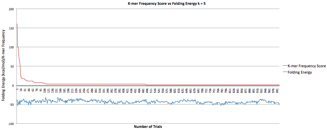
The following three graphs show what happens when the k-mer frequency score was minimized. This first graph is from when k = 5. The red line is the k-mer frequency score and the blue line is the folding energy. There were 1000 trials.
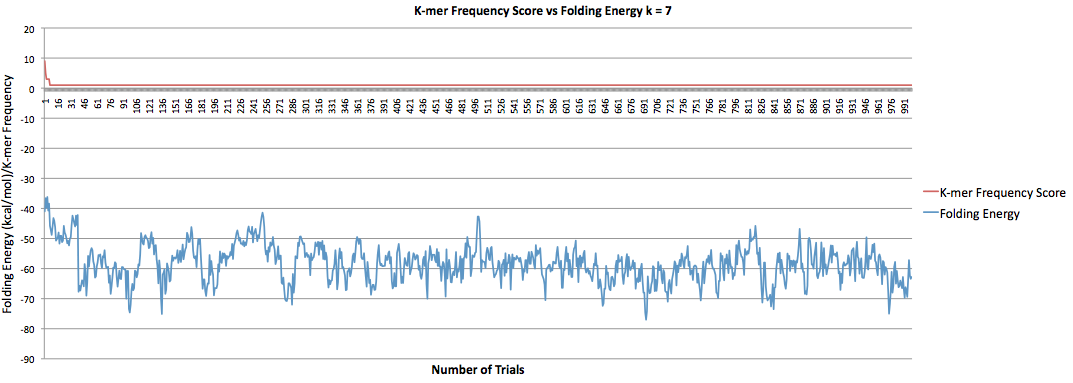
This next graph is from when k = 7.
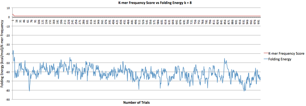
This next graph is from when k = 8.
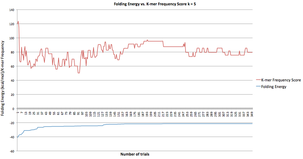
Below is the updated graph for when folding energy was purposefully maximized.