Since I last update I have managed to get Unafold to work and have conducted a variety of experiments. For one experiment I maximized the kmer score and the other I minimized. For each I varied the value of k from 1 to 10.
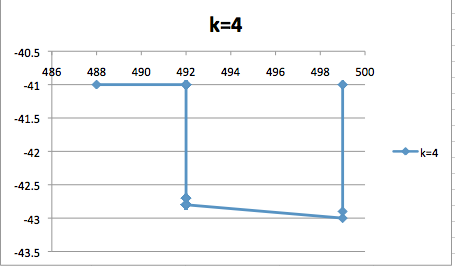
Here I have a graph from when I maximized the kmer frequency score and k = 4.
Here I have a graph from when I maximized the kmer frequency score and k = 4.
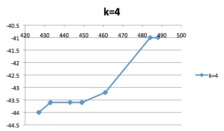
Here I have a graph from when I minimized the kmer frequency score and k = 4.
Unfortunately, I was unable to get gnupplot to work so I eventually had to settle for creating graphs in Excel. One of my goals this week is to get gnuplot to work as using it will save considerable time.
